The last year and so has been a crazy year for G-Shocks. With the 30th anniversary going on we had Anniversary Editions, Collabs, and Limited Editions. Many of the collabs were criticized by the G-Shock veterans as a "weak collab". I was unsure of what they meant, I mean what is a "strong collab"? I found out.
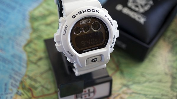
So enamored with this watch I have taken some dirty cell phone pics, but it is deserving of better. Labelled as a "Premium Edition" this was not a Casio release but a Bandai (parent company to the brand One Piece) release. As such it was pre-orderable through the Bandai website to Japan only. I do not know if they retailed any at storefronts or if they were internet only, I only know they sold out quickly. I have read conflicting reports of productions #'s (2,000 pieces and 3,000 pieces). Let me show you some of the Premium in this Edition
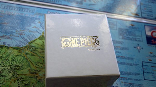
"Just a box chrisek!" I know, I am just used to flimsy cardboard boxes is all. Except the ones with trunks tend to be more sturdier like this but with a lesser finish. Even the bottom of the box is different.
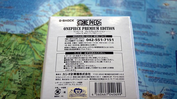
In a lot of ways nothing special. I mean I can't even read most of it! Yet the attention to detail is obvious, even on the bottom of the box you can tell they put effort in.
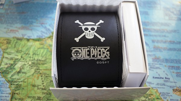
How is that for a surprise? I was expecting a tin or a trunk or an inner cardboard box or something. Let's flip down the front panel.
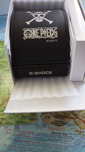
Yes! Definitely not what I was expecting at all. Pull it out.
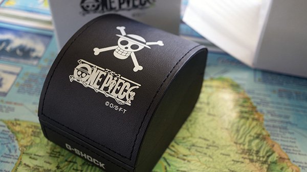
How is that for cool? It feels leather-y but isn't. Very rich effect and love the graphics on it. I understand that Casio has used this container for some MR-G's and the Ruby Frog (GWF-T1000BS) though I have never seen it before, definitely never in person or customized like this!
Pop it open to see the watch.
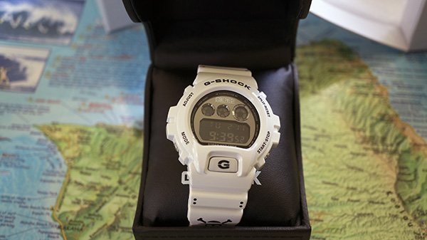
Yes!!! Spent a lot of time on the packaging, but really this is a G-Shock forum not a container forum. One last thing to point out, notice anything unusual? Maybe the pillow? I'm more used to white pillows on G-shocks, notice how this one is black? That's not all.
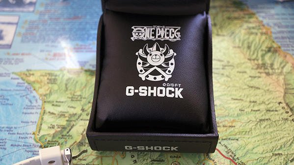
How is that for cool? And the fabric of the pillow is thicker than my white ones as well. If only it were bigger. . . .
Let's get back on topic and back to the watch.

There we go. When handling it, you can't help but notice the straps. They are simply over the top.
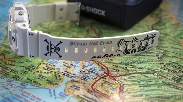
And the short strap with the buckle is also detailed with it's own graphic
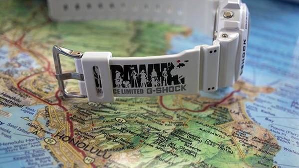
Man that keeper gets in the way!! Move it over to the right would ya?
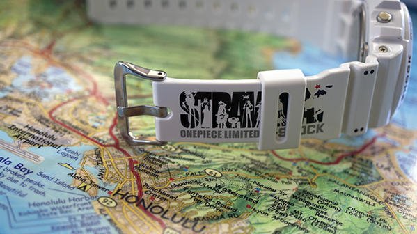
Yes! You can see how cool the graphics are yet how they aren't meant be on a watch. I like it and can see how some would buy this watch just for display. I mean look at how conflicting the graphics are when the strap is buckled.
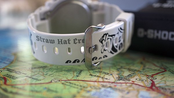
And yet it's still cool! :encouragement: Look on the right side of the buckle as well.
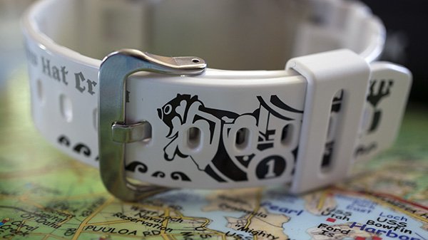
"Oh, so this is just straps on a 6900?". Nope. it isn't. Details abound.
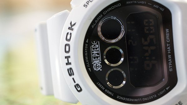
I like this picture a lot for some reason :welcoming: Notice the OnePiece logo on the left, then go to the right "under" the time display. "STRAW HAT CREW". Subdued and in the normal Casio font, you don't notice it at first. Flip it over and hit the caseback.
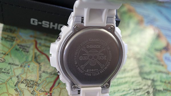
I like it a lot. Love it when collabs have the custom casebacks.
Very happy to have acquired this watch and look forward to wearing it. One thing that has impressed me more than anything else about this watch is that it has raised my standards for collabs. Just over the top in many aspects, I'm actually not much of a fan for DW's but this was so well executed that it is firmly a keeper for me.
Hope you enjoyed the reading and the pics!

So enamored with this watch I have taken some dirty cell phone pics, but it is deserving of better. Labelled as a "Premium Edition" this was not a Casio release but a Bandai (parent company to the brand One Piece) release. As such it was pre-orderable through the Bandai website to Japan only. I do not know if they retailed any at storefronts or if they were internet only, I only know they sold out quickly. I have read conflicting reports of productions #'s (2,000 pieces and 3,000 pieces). Let me show you some of the Premium in this Edition

"Just a box chrisek!" I know, I am just used to flimsy cardboard boxes is all. Except the ones with trunks tend to be more sturdier like this but with a lesser finish. Even the bottom of the box is different.

In a lot of ways nothing special. I mean I can't even read most of it! Yet the attention to detail is obvious, even on the bottom of the box you can tell they put effort in.

How is that for a surprise? I was expecting a tin or a trunk or an inner cardboard box or something. Let's flip down the front panel.

Yes! Definitely not what I was expecting at all. Pull it out.

How is that for cool? It feels leather-y but isn't. Very rich effect and love the graphics on it. I understand that Casio has used this container for some MR-G's and the Ruby Frog (GWF-T1000BS) though I have never seen it before, definitely never in person or customized like this!
Pop it open to see the watch.

Yes!!! Spent a lot of time on the packaging, but really this is a G-Shock forum not a container forum. One last thing to point out, notice anything unusual? Maybe the pillow? I'm more used to white pillows on G-shocks, notice how this one is black? That's not all.

How is that for cool? And the fabric of the pillow is thicker than my white ones as well. If only it were bigger. . . .
Let's get back on topic and back to the watch.

There we go. When handling it, you can't help but notice the straps. They are simply over the top.

And the short strap with the buckle is also detailed with it's own graphic

Man that keeper gets in the way!! Move it over to the right would ya?

Yes! You can see how cool the graphics are yet how they aren't meant be on a watch. I like it and can see how some would buy this watch just for display. I mean look at how conflicting the graphics are when the strap is buckled.

And yet it's still cool! :encouragement: Look on the right side of the buckle as well.

"Oh, so this is just straps on a 6900?". Nope. it isn't. Details abound.

I like this picture a lot for some reason :welcoming: Notice the OnePiece logo on the left, then go to the right "under" the time display. "STRAW HAT CREW". Subdued and in the normal Casio font, you don't notice it at first. Flip it over and hit the caseback.

I like it a lot. Love it when collabs have the custom casebacks.
Very happy to have acquired this watch and look forward to wearing it. One thing that has impressed me more than anything else about this watch is that it has raised my standards for collabs. Just over the top in many aspects, I'm actually not much of a fan for DW's but this was so well executed that it is firmly a keeper for me.
Hope you enjoyed the reading and the pics!
